8 Facts about Bar Charts
Let me show you the interesting grouped data created in rectangular bars in Facts about Bar Charts. The length of the rectangular bars should represent the proportional values. You can have the bars in vertical or horizontal position. The bar charts are very important for those who want to represent data in simple ways. Find out more interesting facts about bar charts below:
Facts about Bar Charts 1: column bar chart
The column bar chart is used to call the vertical bar chart. If you want a bar chart used to show the comparisons of all categories, you need to use the bar graph. It can be plotted in vertical or horizontal bars.
Facts about Bar Charts 2: the bar graph
As I have stated before, the bar graph is used to show comparisons among the categories. The specific categories are located on one axis. The discrete value is seen on the other axis.

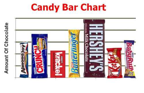
Bar Chart Ideas
Facts about Bar Charts 3: the first bar graph
The Commercial and Political Atlas was written by William Playfair and published in 1786. The bar graph appeared for the first time in this book.
Facts about Bar Charts 4: the range
There are different ranges in bar charts. All data will be fit on the chart if they are scaled. You can use any order to arrange the bars on the charts.

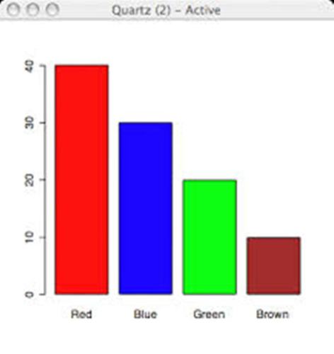
Bar Charts
Facts about Bar Charts 5: Pareto charts
Pareto chart is type of bar chart. It is different from other types of bar charts because they are arranged from the highest to the lowest incidence. If the bar chart represents the frequency, you can arrange it based on the time sequence or chronological order. If you just want to show the information in the similar sequence on every bar, you can pick the stacked bar graph.
Facts about Bar Charts 6: Categorical data
What is the categorical data? It is visualized in the bar graph charts. The data that you have earned should be transformed into the categorical data. Some examples of categorical data include animals, age groups, year, months and show size. They represent the qualitative information.
Bar Chart
Facts about Bar Charts 7: the color coded
You can use different colors on the bar to show the different grouping of data.
Facts about Bar Charts 8: the usage of bar charts
Bars charts are used to show various data such as the industrial productions, agricultural production, continuous data and population living in different regions. Present the data on the bar chart as accurate as you can. Get facts about agricultural production here.
Facts about Bar Charts

Bar Chart Pic
Do you like reading facts about bar charts?


